Latest Entries »

Wonderous Stories

Science is sometimes criticized as draining the meaning and beauty out of existence, when in reality it has the opposite problem.

Because it allows one to acquire knowledge otherwise inaccessible to common perception, science gives us access to a whole other landscape, with terrifying and beautiful scenery. It is hard to discuss the history of earth through deep time without falling into epic geopoetry: an oxygen catastrophe so intense the oceans rusted; the sudden diversification of life at the beginning of the Cambrian; the collapse of a habitable Antarctica with the opening of the Drake passage and the start of the circumpolar currents.

I’m going to share a few of the stranger creatures that live in this landscape, or the glimpses that we’ve gotten of them through the haze. They are horrifying, but beautiful, and I think that they make us look at everyday things in new, challenging ways.

“He spoke of lands not far
nor lands they were in his mind.
Of fusion captured high
where reason captured his time.”

Life on land is hard. It’s dry, for one thing; a lot of evolutionary engineering goes into maintaining moisture, and it’s irradiated by ultraviolet light. It’s a really interesting story how complex life spread to the land, but one of the creepier chapters is the evolution of land plants. Did early algae just throw themselves on the beach, slowly evolving in intermediate environments? Some scientists have theorized that something more interesting was happening on those primordial shores.

More than 90% of plants are mycorhizal. That is to say, they have fungal symbiotes in their root systems. These associations are ancient; fossils in the Rhynie cherts show that they were around 400 million years ago. And they’re weird. For one thing, the fungi can siphon off nutrients from the host plant, then feed them to other plants which get their nutrition solely through this exchange.  They also probably play a role in gathering mineral nutrition from the soil for their host plant. Some associations are obligate and very specific; this is why orchids can be difficult to grow.

monotropa in da house

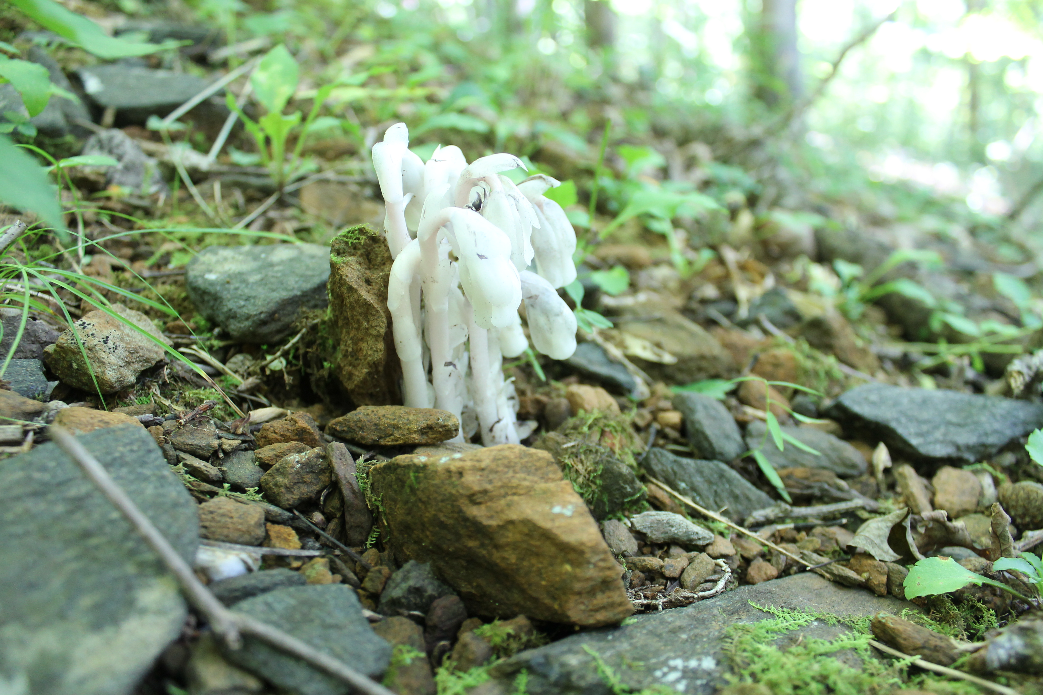
Indian pipes (monotropa) are shown here poking out of the forest floor. They feed exclusively off of a mycorrhizal network which exchanges nutrients with surrounding trees.

What if land plants, what we think of as single organisms, are actually so closely associated with fungi as to be considered partly compose of fungus? That’s the basic idea of the fungal fusion hypothesis. Working together, the fungus and the alga would have been better able to move onto land than either individually. For example, the fungus could have extracted mineral nutrition to the benefit of the alga, while the photosynthetic alga provided food, or compounds to screen the two of them from UV light. Mycorhizal interactions create oily substances in modern plants which protect them from drying out; such an interaction could have protected an early land plant from desiccation as well.

It may have been that land plants were merely an association of fungi and algae, essentially overgrown, vascularized lichens. “Mycotrophism made terrestrial plant life possible,” writes (Pirozynski and Malloch 1975). But it may have been more intimate. Living together, the fungi may well have become an endosymbiont, living inside of the algal cells. Over time, this relationship could have been restructured, fusing fungal genes into a single consolidated genome. Land plants could well be a remix of preexisting creatures. Its not the first such endosymbiosis; chloroplasts and mitochondria arrived on the scene the same way.

 
Pirozynski KA, & Malloch DW (1975). The origin of land plants: a matter of mycotrophism. Bio Systems, 6 (3), 153-64 PMID: 1120179
 
Jorgensen R (1993). The origin of land plants: a union of alga and fungus advanced by flavonoids? Bio Systems, 31 (2-3), 193-207 PMID: 8155852
 

“…It is no lie I can see deeply into the future.
Imagine everything
You’re close
And were you there to stand
So cautiously at first and then so high….

What is cancer?

Usually, the answer is that it’s cells which have gone on a solo career. They consume the body’s resource and produce nothing useful to the organism, only more of themselves. They are selfishness personified. But there are anomalies which this simplistic account doesn’t explain. For example, why would selfish cancer cells cooperate with one another in tumor formation?

A cancer cell. Click for source.

A longstanding criticism of cancer biology and oncology research is that it has so far taken little account of evolutionary biology,” write (Davies & Lineweaver 2011). They’ve taken a new look through an evolutionary lens and come to the conclusion that cancer is an atavism.

Atavisms are regressions to a more primitive evolutionary states. For example, birds are evolutionarily derived from reptiles with teeth, but do not have teeth themselves. Usually. In rare cases, those ancestral reptilian genes are reactivated, and a bird with teeth will result. That’s an atavism. The notion which these researchers propose is that cancer is an evolutionarily primitive state which emerges when cells are damaged by chemicals, radiation, or time.

The evolution of multicellular life, they propose, required a robust toolkit of cellular communication pathways in order for individuals to cooperate first as a loosely knit colonies with basic division of labor. These tumor-like growths, the first steps toward multicellular life, are what the authors call “Metazoa 1.0“. On top of this basic genetic framework for the self-organization of cells there evolved a further regulatory network responsible for the complex organization of Metazoa 2.0 like us. It’s this delicate regulatory network which goes awry in cancer. At that point, the ancient toolkit is activated and the atavistic mode kicks in.

If true, this framework is a hopeful one. Conventionally, the impressive arsenal of skills available to cancer has been explained as evolutionary adaptations, fed by the cells’ high rate of growth and mutation. This would mean that its arsenal is open-ended, able to evolve dynamically in response to therapy. But if it’s an atavism, though, its toolkit is a finite set limited by what was available to metazoa 1.0.

 
Davies, P. C. W.,, & Lineweaver, C. H (2011). Cancer tumors as Metazoa 1.0: tapping genes of ancient ancestors Physical Biology, 8 (1) DOI: 10.1088/1478-3975/8/1/015001


“Sound did silence me
leaving no trace.
I beg to leave,
to hear your wonderous stories.”

It’s one thing to find unsettling fossils in the genomes of plants, or in pathologies. It would be something else entirely if there was something strange and beautiful lurking deep inside ourselves.

The human genome is littered with dead viruses. It starts with a retrovirus, something like HIV maybe. It reproduces by inserting its genes into its host’s DNA, where they get expressed by the cell’s transcription/translation machinery. Most of these cells die with the host, but every now and then a germ line cell gets infected, a sperm or egg. This viral hitchhiker then gets passed on to the organism’s progeny. Over time, they’re usually inactivated by mutations, or actively silenced, but they pile up. 8% of the human genome is composed of dead viruses.

syncytin

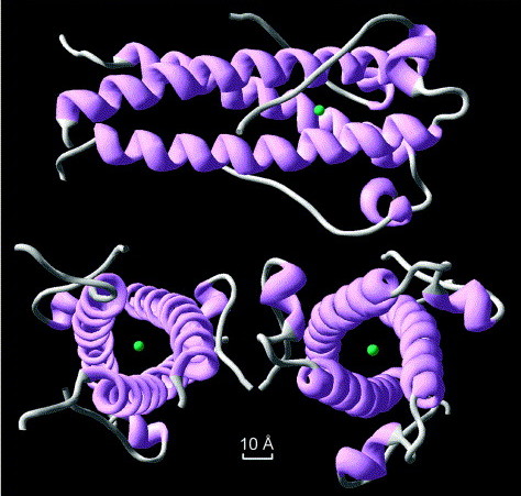
The structure of syncytin, a retrovirus protein which has been recycled in the human genome. Image source from Renard et a 2005; click for link.

It gets weirder. Meet syncytin; it’s a protein which is involved in placental formation in humans. It’s also part of an ancient, repurposed viral gene. Not only was this virus integrated into our genomes, it was rebuilt into an essential part of the mammalian life cycle. It’s happened several times, too: mouse syncytin is derived from a different viral infection than primate syncytin. Experiments on mice show that without this gene, the placenta misforms. Another retrovirus is involved in placenta formation in sheep.

Apparently, mammals across the evolutionary tree have been independently infected by retroviruses, incorporated those viruses into their genomes, and specifically put them to work building placentas. Did these particular viruses just happen to carry genes preadapted for placental formation? Or did mammals evolve and diversify as a result of viral genes flowing into their genomes? What other key biological pathways used to be free-floating viruses?

 
Mi S, Lee X, Li X, Veldman GM, Finnerty H, Racie L, LaVallie E, Tang XY, Edouard P, Howes S, Keith JC Jr, & McCoy JM (2000). Syncytin is a captive retroviral envelope protein involved in human placental morphogenesis. Nature, 403 (6771), 785-9 PMID: 10693809
 

 Dupressoir, A.,, Vernochet, C.,, Bawa, O.,, Harper, F.,, Pierron, G.,, Opolon, P.,, & Heidmann, T. (2009). Syncytin-A knockout mice demonstrate the critical role in placentation of a fusogenic, endogenous retrovirus-derived, envelope gene. Proceedings of the National Academy of Sciences of the United States of America, 106 (9) DOI: 10.1073/pnas.0902925106

V

One of my hobbies is sacred geometry‭ ‬-‭ ‬loosely defined,‭ ‬it’s the study and use of mathematical archetypes in nature and culture,‭ ‬often with a focus on traditional compass and straightedge constructions.‭

Don’t worry‭; ‬I’m not about to go off into numerology,‭ ‬telling you that you can derive the groovy cosmic secrets of the ancients by studying numeric coincidences.‭ ‬I actually take a rather dim reading spurious meaning into special cases of the Interesting Number Theorem.‭* ‬The worst case scenario might resemble the Arronofsky film‭ “‬Pi‭”‬,‭ ‬except without the sweet soundtrack.

Nonetheless,‭ ‬exploring the traditions behind sacred geometry can give insight into art and design.‭ ‬The traditional compass and straightedge drove the development of mathematics until just a century or two ago,‭ ‬and modern algebra has its roots in questions about why it is,‭ ‬exactly,‭ that ‬you can’t construct a perfect heptagon‭. The practice is also fun and relaxing, and can even give occasional insights into physical reality.

design2

One subject that comes up a lot in these discussions is a number called the golden ratio,‭ ‬sometimes abbreviated phi.‭ ‬Phi is defined in terms of the relationship between a line segment and its parts.‭ View full article »

Watts Up With That is a very, very silly website.

Here’s what I mean: In a recent article at WUWT, chemical engineering graduate Steve Burnette tries to dismiss concerns about ocean acidification, but his claims are outright wrong when they are coherent. The centerpiece of the article is a calculation meant to estimate the change in ocean pH over the 20th century. Unfortunately, it’s been badly bungled.

First, let’s go over a few preliminaries.

The carbon dioxide system

Figure 1: The carbonic acid equilibrium system. Atmospheric CO2 is in equilibrium with dissolved CO2, which in turn is in equilibrium with carbonic acid. The acid has a tendency to lose its hydrogen ions, forming bicarbonate ion, which it is also in equilibrium with. The bicarbonate can also lose a hydrogen ion, forming carbonate. Keep in mind that these steps work in reverse; in particular, carbonate ions can react with hydrogen ions to form bicarbonate.

When fossil fuels are burned, about a third of the resulting carbon dioxide ends up dissolved in the oceans. There, it undergoes a series of reactions, first combining with water to form carbonic acid, then losing protons one at a time. The result is a mixture of dissolved CO2, bicarbonate, and carbonate ions, as well as an increase in hydrogen ions, which increase the acidity of the seawater.

Burnette mentions a few principles which are useful for analyzing this scenario. The equilibration between gaseous CO2 and dissolved CO2 is expressed by Henry’s law, which states that the concentration of dissolved CO2 is proportional to the partial pressure of atmospheric CO2. This means that, as CO2 concentrations increase in the air, they will increase in the oceans too. Mathematically: View full article »

If you’ve ever taken an organic chemistry lab class, you’ve probably done a melting point determination. That’s when you take a small sample of a solid, heat it up, and make note of the temperature at which it melts. This can be used to identify an unknown, but it is often used to assay purity. This is because impurities tend to make solids melt over a range of temperatures rather than at a single point, and because they tend to lower the melting point overall. There are fancy instruments you can buy which will measure melting points, but they’re so simple that I decided to make my own.

One way to do it is to use a Thiele tube, but I didn’t have one of those lying around. So I reached for my volumetric flask, filled it with mineral oil, and set it on a hot plate. Then, I put a tiny bit of the chemical vanillin into a capillary tube; this is my sample to test. I rubber-banded the capillary tube to a thermometer, such that the sample was next to the bulb. I set up a stand and clamped the thermometer in place, suspended in the mineral oil.

This would have worked, except that the samples used are typically so small that they are difficult to see with the naked eye. So I grabbed my USB microscope and clamped it in place, focused on the sample.

do it yerself

With my apparatus assembled, I turned up the heat and sat back to watch. Sure enough, between 80 and 82 degrees C. My copy of the Merck Index actually gives two melting point ranges for this compound, 80-81 and 81-83 degrees, which is a little confusing but seems to confirm that my melting point apparatus works as expected. Sweet!

melting

In case you haven’t heard, the North Carolina General Assembly has run amok.

It’s hard to believe that things could get worse: the last NCGA approved Ammendment One, which declared that straight marriage was the only recognized family. And they tried to outlaw accelerating sea level rise by declaring that straight lines were the only recognized graph.

And yet after the 2012 election, things turned upside down.

  • Senator Tom Tucker displayed amazing arrogance and unfamiliarity with his job description when he told a reporter: “I am the senator, you are the citizen. You need to be quiet” (Huffington Post)
  • A House resolution was proposed which would allow the establishment of a state religion, as well as incorporating prayer as a public institution (WRAL)
  • Another bill was proposed to criminalize womens’ nipples. (DTH)
  • The budget committee has considered making ends meet by closing NC’s public universities (a tactic known as, ‘eating your seed corn’) (N&O)
  • The Senate has passed a bill rolling back 40 years of environmental protections in order to make way for fracking, in defiance of the state Department of Environment’s recommendations. (McClatchyDC)

That’s just some of the more bizarre social experimentation going on; there’s been plenty of garden-variety attacks on voting rights, public education and social services for the poor.

The point of all this is, a lot of people are justifiably annoyed. So much so, that weekly protests at the state capitol have broken out, headed by the state NAACP and dubbed ‘Moral Mondays’. Peaceful protesters have been arrested by the score, then the hundred, for voicing their disgust with a runaway legislature.

Conservatives have fought back, and some have fought dirty. In one especially skeezy move, the right-wing Civitas Institute has published a public database of information on the protesters, including their photograph, and city of residence. It’s creepy, but now that it exists, it’s a window into what is happening on Moral Mondays.

The Civitas data record a total of 457 arrests. Of these, all but 8 gave their residence as in North Carolina. That is to say, 98% of the arrested are clearly locals. This data reinforces an earlier survey which found the same proportion in the protesters as a whole. This matters because some, including governor Pat McCrory have tried to dismiss the protests as the work of outside agitators.

Something disappointing about the Civitas effort is that the infographics provided are drab and at times completely inappropriate. (I mean, really?)

To show them how it’s done, let’s map out some information. Here are the absolute number of arrests, categorized by county and by city. Unfortunately, the city data which were available from the NC DOT did not have all of the cities in the arrest data, leading to 65 of 85 cities being represented in the map, explaining why some counties (eg, Cherokee) report arrests but contain no cities reporting arrest. This may introduce a bias in which smaller cities and towns are not represented when city-based data are used.

Words

Fig 1a. Moral Monday arrests, binned by county.

Words

Fig 1b. Moral Monday arrests, binned by city

Composite

Fig 1c. Composite map of 1a and 1b.

A few things seem to pop out: Arrests are geographically centered around the Triangle (Chapel Hill, Durham, and Raleigh), with other major centers around cities (eg, Charlotte, Wilmington, and Asheville). Comparing to other political maps (such as Amendment One or the 2012 presidential election), this pattern is not surprising, however, why it is happening is less clear.

View full article »

beesknees

Figure A: The knee of a bee

I recently bought a 80-800x USB microscope. It has really good quality for less than $40, and I’ve been using it to get up close and personal with crystals, dead bugs, and gross parts of my anatomy. Feast your eyes!

A wasp, with a bizarre, insectile tongue

A wasp, with a bizarre, insectile tonguemouththing. Proboscis. Weird.

mole

One of my moles. Maybe it’s time I get it looked at, hm?

I wasn't too thrilled to find out that I had warts, but they grow on you.

I wasn’t too thrilled to find out that I had warts, but they grow on you.

thermite bead

Iridescence in a bead of thermite residue.

cuso4

Copper sulfate blocks

cuacet8-4

Feathers of copper acetate

cuacet8-3

Copper acetate closeup

I hope to get some polarizing filters and videotape the growth of chiral crystals, like sugar or vitamin C. Stay tuned…

Today in LabLulz, I’m going to walk through a recent preparation I did in my chemistry lab: increasing and measuring the concentration of hydrogen peroxide.

WARNING: This procedure involves heat and the end product is a powerful oxidizer. Don’t get burned and don’t get it on yourself – wear gloves, splash-resistant goggles, and an apron. I had a spill of ~15%, all over everything, including myself. It was okay, but only because I followed safety protocols. I didn’t have the apron though, and I had to get pantsless.

Hydrogen peroxide is an interesting substance; it’s formula is H2O2, meaning that it is composed of two hydrogen atoms bonded to two oxygen atoms.

sdfsfasdf

Figure 1. Behold, the hydrogen peroxide molecule!

It is a powerful oxidizer, decaying into water and free oxygen. This is because the bond between the two oxygen atoms, called the peroxide bond, is unstable. Some substances which contain the peroxide bond are even explosive, like triacetonetriperoxide. Because it’s an explosive precursor, and somewhat dangerous on its own, concentrated hydrogen peroxide can be difficult to come by. The weak 3% solution found in drugstores is all that is available to DIYers, hobbyists, and other scientists outside of the mainstream chemical supply chain.

Fortunately, it is relatively trivial to increase the concentration from 3% to around 30%. There are several tutorials on the subject at YouTube (TheChemLife; zhmapper, nerdalert226) so I’m going to focus on measuring the concentration of the end product, a procedure which the videos tend to treat very qualitatively. I hope this tutorial will be informative and useful, even outside of punklabs; the process is easily generalized and density is important in many fields, including medicine and winemaking.

The concentrating procedure is pretty simple: pour about 500 mL of the 3% solution into a beaker and heat it, forcing the excess water to evaporate until there is a tenth as much liquid left (peroxide boils at 150 C, compared to 100 C for water.) There are only a couple of tricky points: the liquid must NOT boil, only steam – if it starts boiling, the peroxide will decay. Bits of dust and dirt will also cause disintegration, so the equipment must be kept very clean and free from scratches.

Okay, so after a few hours, I have about 50 mL of liquid. I drop a bit into a solution of corn starch and potassium iodide, and the mixture turns black, a positive test for oxidizers. I add a squirt to some sulfuric acid and copper wire, and the metal wire begins bubbling and the solution begins to turn blue with copper sulfate*. This reaction is faster and more vigorous than when I try it with the 3% solution, so I’ve clearly succeeded in increasing the concentration, but to what level? To answer that question, I’m going to measure the density of the solution. View full article »

I’m revisiting some older research of mine, so that I can talk a little bit about some data visualization I did along the way. If you frequent TriZPUG or the SplatSpace, you might have seen my original presentation, but In Case You Missed It…

You might remember a while back I got interested in researching the statistical thermodynamics of poker tournaments. To briefly recap, I was treating the distribution of chips amongst players as a probability distribution, which meant that I could use the concept of entropy to describe the distribution. Entropy in thermodynamic systems is associated with how ‘spread out’ the energy is in that system: A hot cup of coffee in a cold room has low entropy while warm coffee in a warm room has high entropy. In a statistical system like a poker table, entropy measures how evenly distributed the chips are between the players. When the players start the tournament with equal amounts, the entropy is at a maximum. When one player wins all the chips, the entropy is at a minimum. Already things are interesting – entropy in this statistical system must decrease with time, in stark contrast with the second law of thermodynamics. And we haven’t even looked at what happens between those two points!

Poker entropy

Poker entropy

To better understand the behavior of tournaments, I needed a way to play them and replay them, to turn them into something other than tables of names and numbers. The first representation worked well at illustrating the distribution, but failed to capture the dynamics; except in catastrophic rearrangements, it was not always obvious how the chips moved around from hand to hand.

[link]

What’s going on is, I’ve whimsically renamed the players for anonymity, and then represented the size of their stack with a circle. Each hand is then represented by a transaction in which chips flow from one or more players to a single winner, with chip flow represented by black lines whose size is representative of the magnitude of flow. I find this hypnotic.

If you don’t care about coding, feel free to skip down….

How exactly did I put this together?

Zeroeth, we have to get our tools together.

import pickle, sys    #file IO utilities
import pygame    #pygame library
from pygame.locals import *    #more pygame stuff
from math import sin, cos, pi, sqrt    #math tools

First, there is a great deal of tedious regular expression slicing and dicing that you have to do to convert a tournament history file into usable data; I’ll be merciful and skip that. So I’ve finally bundled up the data in a couple of files.

View full article »

How did TopOc do on last year’s to-do list?

Not bad! As consistent readers might have noticed, the big news behind the scenes is that I have gotten involved in another production space, LumShop. Not only is it providing facilities for DIY Spectro development, it is also kindly hosting my chemistry lab! This will end well, I’m sure.

So what’s next?

  • Even more hard-hitting commentary and sass
  • More fractals and fungaloids!
  • Augmenting and measuring the concentration of hydrogen peroxide!
  • Third generation DIY Spectro!

Between this lineup and my lab, I’m sure the site will stay busy, but if you have any requests or suggestions, leave a comment!

There is a companion article exploring the issue from the perspective of environmental monitoring over at ArkFab.

Human influence on the environment has increased dramatically over the last 10,000 years, to the point that some geologists have argued that human reworking of the earth defines a new geologic age, The Anthropocene. (Zalasiewicz et al, 2008) Much of the focus has been on relatively robust, tangible changes in biogeochemistry. Examples include:

  • megafaunal extinction, accelerated erosion (Zalasiewicz et al, 2008) and nitrogen fixation resulting from the spread of intensive subsistence patterns
  • the loss of stratospheric ozone resulting from the release of novel chlorofluorocarbons

However, fleeting and less tangible effects are also important. Two examples are:

  • the light pollution resulting from urbanization and transportation infrastructure
  • changes in the acoustic environment resulting from direct addition of sonic energy and memes, as well as indirect sources.

A year-long composite view of the earth at night, showing human light generation. White lights are cities; blue lights are fishing boats; green lights are natural gas flares, and red lights are ‘ephemeral light sources’, interpreted as fires. Image from  NOAA National Geophysical Data Center – click for source + discussion.

Light pollution, the scourge of urban astronomers, is a well-accepted phenomenon with serious consequences. A 2004 review begins:

In the past century, the extent and intensity of artificial night lighting has increased such that it has substantial effects on the biology and ecology of species in the wild. We distinguish “astronomical light pollution”, which obscures the view of the night sky, from “ecological light pollution”, which alters natural light regimes in terrestrial and aquatic ecosystems. Some of the catastrophic consequences of light for certain taxonomic groups are well known, such as the deaths of migratory birds around tall lighted structures, and those of hatchling sea turtles disoriented by lights on their natal beaches. The more subtle influences of artificial night lighting on the behavior and community ecology of species are less well recognized, and constitute a new focus for research in ecology and a pressing conservation challenge. (Longcore & Rich 2004)

The amount of sonic energy released by human activity is recognized as an urban nuisance as well as an occupational safety concern. It also has recognized ecological effects: urban European robins have begun singing at night, when they have less acoustic competition. (Fuller et al 2007) Frogs have begun changing the pitch of their croaks in order to talk over traffic noise (Paris et al 2009)  In addition to sonic energy, human activity has released sonic memes into the environment. A meme is a self-replicating information pattern; jokes and computer viruses are two examples of memes. A person or computer acquires a meme and then spreads it, through retelling or infected emails. Sonic memes, such as ambulance sirens and cellphone ringtones, have been picked and repeated by songbirds. (Stover 2009) This is very interesting: human memes, the basis of Richard Dawkins’ ‘extended phenotype’ concept, have organically extended into other animals’ extended phenotype. (Recent reports of dolphins mimicking human speech are also very interesting in this context. The reverse flow also occurs, as animal communications are repackaged as ringtones or ambient music.)

View full article »