
I love graphs – my eyes quickly glaze over at a table of numeric data, but a graph, used correctly, can quickly and easily tell the whole story.
‘Used correctly’ is the key phrase – for all their power, graphs are infamously easy to bungle, and when used incorrectly they can misinform – or lie outright.
I’m going to look at an example that touches on a few graphical and statistical concepts near and dear to my heart, as well as carbon geochemistry.

Fig. 1: An image from C3Headlines; the 3 C's are "Climate, Conservative, Consumer". Oh, and the article is titled "The Left/Liberal Bizarro, Anti-Science Hyperbole Continues". It sure would be tragic if they made obvious n00b mistakes after using such language. Click for link!
Already this is a warning sign – the comparisons the author makes are entirely qualitative, apparently based up on eyeballing the graph. However, trend lines are created by a statistical process called a linear regression, which comes with a caveat: it will fit a trend line to ANY data given to it, linear or nonlinear. Fortunately, there are also ways of evaluating how good a trend line is.

Figure 2: January CO2 concentrations from MLO (red dots), and a linear fit (black line). The linear fit has a slope of ~1.5 ppm/year, and an R^2 of 0.986. Notice that the linear model overestimates the data in the middle of this time period, and underestimates them at the beginning and end. In other words, these data are curved - and curves are nonlinear!
It’s not that we don’t expect there to be any residuals when the phenomenon being modeled is in fact linear – real life data are noisy; we’d expect there to be variation that a linear model doesn’t account for. But if the only nonlinear component of the data was noise, that component would look, well, noisy. (See Figure 3)

Figure 3: (Top) Data are generated at regular intervals according to y = 2x+3, and normally distributed noise (std = 5) is added (blue dots). A linear regression (red line) has been added. (Bottom) Residuals (green) are then calculated from the data and the regression. They do not appear to be particularly patterned, especially in contrast with Figure 4.
Yet, when we look at the residuals from the atmospheric CO2 data, they look anything but noisy:

Figure 4. Residuals from a linear fit to the CO2 concentration data. The residuals are like a magnifying glass for the curvature we observed in Figure 2. Statistical significance of the quadratic fit is high (P~10^-16)
What we see is a clear validation of our observation that the CO2 concentrations show curvature – and significant curvature at that (the p-value for the quadratic fit shown is ~10^-16).
Now that we’ve got a model for the residuals, we can combine it with our original linear fit to get a much better description of the data. The reasoning is that, since:
Residuals = Linear Fit – Data
And since we have a quadratic model for the residuals:
Quadratic Fit = Linear Fit – Data
We can build a nonlinear model for the data:
Nonlinear Model = Linear Fit – Quadratic Fit
When we do this, we get a curve which describes the data much better than the linear regression:

Figure 5. A nonlinear model for CO2 growth, containing both the linear rise and the curvature.
In fact, this nonlinear model looks an awful lot light the light gray curve in Fig 1! Apparently C3 fit the data with some sort of nonlinear model to create the image, but completely ignored it otherwise!
Thusfar, what we have learned is that there is significant curvature in these CO2 data. We’re justified in describing it with a two-degree polynomial model
Y = a*X^0 + b*X^1 + c*X^2
This quadratic model is consistent with an exponential model. An exponential function is actually a sort of infinite-degreed polynomial. If the data are exponential, our quadratic model is describing the first few terms of this infinite polynomial:
e^X = a*X^0 + b*X^1 + c*X^2 + d*X^3 + … + an*X^n + …
Distinguishing between the cases of quadratic, exponential, and superexponential growth requires more complicated statistical techniques, such as those described in (Husler & Sornette 2011). It’s a harder question, and to be honest I’m still thinking about it. What’s easy to see is that these data are most certainly NOT linear.
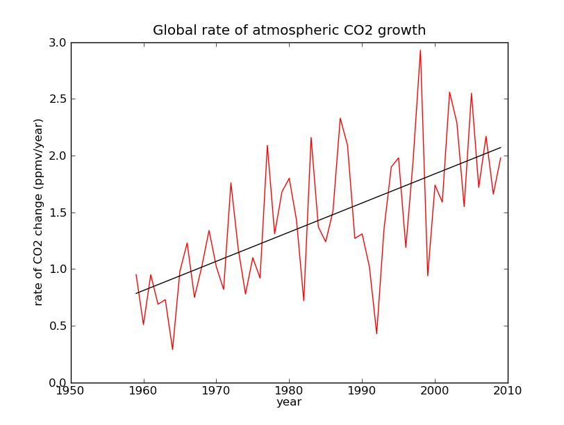
Actually, if you’ve read through some of my earlier discussions, you’ve seen one reason to doubt the linearity of CO2 data. Remeber back when we were talking about the rate of change in CO2 levels, and we found that the rate has increased over time? A linear growth in CO2 is characterized by a constant rate of change; if the rate is increasing, CO2 growth can’t be linear! And though the curvature may appear small, 1.5% of the variation in CO2 concentrations, we’ve already seen that over several decades it really adds up.
When I first was reading the C3 article, my reaction was more or less: who cares? Sure, the CO2 concentrations were clearly nonlinear, but why does it really matter whether they’re superexponential, or “merely” exponential? It’s great to have a model for data, but in this case you’re not going to use it to interpolate, since the data are already fairly complete, and you don’t need a model to fill in gaps. It would also seem questionable to me to use such a model to reliably extrapolate into the future. It might be good to define a business as usual scenario, but the actual course of future CO2 concentrations is not set by our choice of curve fitting; it in fact depends strongly on human agency.
I found the answer in “Evidence for super-exponentially accelerating atmospheric carbon dioxide growth” (Husler & Sornette 2011), the paper that sparked the Joe Romm blag that produced the WattsUpWithThat blagoblag that spawned the C3 blagoblagoblag that led to the current blagoblagoblagoblag. What they did was build a model relating quantities like economic production, technological sophistication, and emissions. Then they used the model and historical data to characterize the economy of world carbon emissions. The authors write:
“The coexistence of a quasi-exponential growth of human population with a super-exponential growth of carbon dioxide content in the atmosphere is a diagnostic that, until now, improvements in carbon efficiency per unit of production worldwide has been dramatically insufficient. […] This statement may appear shocking and counter-factual for developed countries. But, at the scale of the whole planet, one can observe that improvement in carbon emissions (i.e., decrease per unit of output) in the developed countries are counteracted by the increases of carbon emissions in some major developing countries, such as China, India and Brazil, which use carbon emission inefficient technologies (for instance heavily based on coal burning). ”
There’s a few more lulz in the graph/data department over at C3. Check back soon for Part II.
* Why only January values are used is not made clear.
EDIT: This article got reblogged!
goblagoblagoblagoblagoblah
Monthly CO2 Concentration Data (MLO)
Statistical processing by ZunZun
Andreas D. Hüsler, & Didier Sornette (2011). Evidence for super-exponentially accelerating atmospheric carbon dioxide
growth arXiv arXiv: 1101.2832v3


I am glad my web site – http://zunzun.com – could be of use to you. Please let me know if you have any questions or suggestions for the site.
James R. Phillips
2548 Vera Cruz Drive
Birmingham, AL 35235 USA
zunzun@zunzun.com
The standard numpy/scipy tools I use didn’t return a significance for polynomial fits, and I couldn’t get R working, so your site was very useful. Thanks!
Very interesting. I’m not familiar with the field of statistics, but this was informative. Regarding p-values – this is what another statistician has to say about their use: see Dance of the p values at http://www.youtube.com/watch?v=ez4DgdurRPg
Thank you for the article.
Thank you for the video; I thought it was very entertaining and informative.
p-values aren’t the greatest statistical tool in the world, and they are often misinterpreted. One of my favorite examples comes from the nerdy webcomic XKCD:
http://xkcd.com/882/
There is a lot more information on the use and abuse of p’s here:
http://en.wikipedia.org/wiki/P-value#Misunderstandings
Additionally, significance is assigned by comparing the p-value to a confidence interval (CI), which has been chosen beforehand – your video discusses this when it attaches theme songs to various p’s. However, the choice of what CI to use is somewhat arbitrary. The 95% CI is an industry standard, but it’s not set in stone – there isn’t anything magickal about it. So to a certain extent, I think that the recent controversy over whether or not short-term global warming trends hit p<0.05 is a bit of false framing. ( http://www.skepticalscience.com/phil-jones-warming-since-1995-significant.html )
I'm not that familiar with stats or probability myself; they are complicated and counterintuitive, and I get a little queasy with anything more complicated than an average or "Sue has three red balls and two green balls and a box and he picks one out at random…" In this case, calculating p felt like more of a formality than anything; in school, we usually just eyeballed the residuals.
Thank you for reading!