
A part of my John Everett series – read more: 0/I – II.0 – II.5 – II.75 – III.0 – III.3 – IV.0 – IV.4 – IV.8 – V – VII – VIII – Full Report
The CO2 scenarios are literally falling flat and need revision. The observational trend line shows monotonic growth – pretty much a straight line as in the chart below of global marine CO2 measurements (NOAA data)4, while the IPCC scenarios used in most research rely on an accelerating growth. Certainly the predicted rapid acceleration of the IS92a model (see solid black line in middle of the figure on the right) is missing from the NOAA data plotted below. In fact, if the last 8 or 12 years are representative of the future, we might imagine a downward slope in the growth rate.
Last time, we looked at one claim Dr. Everett makes in this paragraph: that the measured rate of change in atmospheric carbon dioxide is inconsistent with the emissions scenarios used to predict future ocean acidification. To do this, he plays fast and loose with quantities and their derivatives (the rates at which they change.) The imprecision extends even to his quoted numbers: in pidginthe previous paragraph, he gives a growth rate as “3.05 ppm”. That’s a not a growth rate; it’s a concentration. He means 3.05 ppm per year. His projection is an extrapolation of “the average rate of increase for the past 10 years (1.87/year)…” 1.87 WHAT per year? I know that he means 1.87 ppm/year, but a lot of people wouldn’t, and I shouldn’t have to make assumptions. If Everett is being sloppy with his units, he’s being sloppy with his science.
The other claim that Dr. Everett draws from the rate of change in CO2 is that “the growth rate seems to be leveling off, if not declining […] In fact, if the last 8 or 12 years are representative of the future, we might imagine a downward slope in the growth rate. ” Look at the graph of the growth rate again. It goes up and down- a lot.

The record of changes in atmospheric carbon dioxide since 1980. It's got it's ups and downs. Click to see the full record back to 1959.
Here’s an example. I’ve taken the data and plotted the 12-year trend lines*, since that’s what Dr. Everett bases his analysis on.

The growth rate data Everett presents, with linear fits. The thick green line shows the trend in the data as a whole: the growth rate is increasing with time. The thin black lines are linear fits applied to each series of 12 consecutive years. It's pretty clear that, in general, 12 years of this dataset aren't enough to safely extrapolate.
You can see that yes, Dr. Everett is correct that the last 12 years show a very slight downward trend. The problem is that it’s almost certainly not real. For one thing, its statistical significance is low – the p value for the last 12 years of data is about 0.95.** That means that there’s a 95% chance that a trend this small could be generated just by random noise.
For another thing, it’s not that impressive that the last decade or so is slightly declining when you take the data as a whole into account. There are several 12-year periods in this time series which have a more or less flat trend. There are some such periods that have a significant negative trend. And there are some that have a significant positive trend.
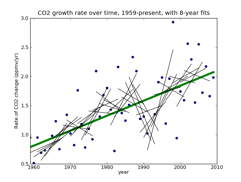
What does this mean? It means that just 12 years of this data aren’t enough to tell us much. There’s just too much noise at that timescale to accurately measure the signal. And if 12 years of data aren’t enough to measure the underlying signal, 8 years definitely aren’t either:

Same as above, except that the fits are to 8-year periods rather than 12. Extrapolating these is an even worse idea.
The last decade or so don’t show a clear trend- they could well be completely flat. On this basis, Dr. Everett is proposing to extrapolate the flat trend to the end of the 21st century. This doesn’t seem reasonable to me. It’s pretty clear that at these time scales, linear trends are too noisy to extrapolate very far. Look at the graph above- would extrapolating the sharp upswing in 1991-1999 have been a good idea? Would it have been justified? What about the sharp downswing in 1986-1994? It’s pretty clear tha projecting patterns from a decade of this data a century into the future is risky at best. And he’s doing it in the face of a clear upward trend at longer timescales!
So far, we’ve been looking only at the data that Dr. Everett shows us- going back to 1980. This measurement record, however, extends back to 1959. Needless to say, when you look at the whole series, a slight downtrend in the last few years isn’t particularly impressive. You “might imagine a downward slope in the growth rate”, but this data gives you no reason to believe it’s anything but your imagination.

Some of the projected carbon dioxide scenarios we've discussed. Notice that they all involve substantial increases in CO2 concentration beyond even current levels. Dark blue: "Business as Usual". Green & black: extrapolation of trends in measured growth rate. Purple & light blue: flat growth rate at average rate of last 10 years. Red: Measured CO2 concentrations.
The graph above compares the projections we’ve been talking about. The dark blue line is the IPCC’s Business as Usual scenario: IS92a. The red line is carbon dioxide concentration, measured at Mauna Loa Observatory; I’ve included it for reference. The green and black lines extend the upward trend that we see in the rate data (the answer changes slightly depending on whether you use the data back to 1980, as Everett does, or the full dataset to 1959.) The purple and light blue lines are based on Dr. Everett’s projections. There are two lines because his stated average growth rate for the last decade, 1.87[ppm]/year, is not the true average growth rate (1.98 ppm/year.) It doesn’t significantly impact the projection, but it’s disappointing to me that Dr. Everett is being so careless as to fumble something as simple as an average, and in a setting as serious as Senate testimony.
All of the projections, even Dr. Everett’s, entail significant increases in atmospheric CO2, which will result in acidification beyond even what we’ve already seen. And the growth rate data Dr. Everett presents? Taken as a whole, they do predict to lower CO2 levels than in the “Business as Usual” scenario- but they agree with the IS92a a lot better than they do with Everett’s projection!
Does that mean that Dr. Everett is necessarily wrong about what CO2 levels will be a century from now? No- the future is unwritten. Maybe we’ll develop effective climate legislation over the next hundred years. Maybe the concentration will be 550 ppm, rather than 650 or 700. The point is that his evidence doesn’t support this claim. Conversely, should we necessarily believe that the concentration will be in the high 600’s? Is it necessarily a good idea to project the growth rate data a century into the future? No- but it’s a much better idea than extrapolating just the last handful of that data.
Like I said, there’s a lot going on just in this paragraph. But there’s more in this section than needs to be addressed. Next time, we’ll look at his claims about the ocean as a carbon sink.
~~~—~~~
* What this means is I take the first twelve data points, #1 through #12, and I use a statistical tool called a least-squares fit. This tool takes data and “fits” it with a straight line- that is to say, it draws the best straight line through the data that it can. Then, I do the same thing with data points #2through #13, #3 through #14…
** A least-squares fit doesn’t think about the data you give it- it just draws a line through them. If you give it a bunch of constant data, the least-squares fit will draw a flat line- slope zero, no trend. But if you add to that flat line a bunch of random noise, the slope is unlikely to still be zero. the p-test compares the amount of noise to the size of the trend in a linear fit to give the probability that the observed trend is generated by the observed noise- it measures the probability that the trend is a statistical fluke. A p value close to 1 is less significant; a p value close to 0 is more significant.


GOOD LORD how long has that graph (Various CO2 projections) had ppm/year as the vertical units? I am a moron. How embarassing. I’ll fix that soon. >_<