In case you haven’t heard, the North Carolina General Assembly has run amok.
It’s hard to believe that things could get worse: the last NCGA approved Ammendment One, which declared that straight marriage was the only recognized family. And they tried to outlaw accelerating sea level rise by declaring that straight lines were the only recognized graph.
And yet after the 2012 election, things turned upside down.
- Senator Tom Tucker displayed amazing arrogance and unfamiliarity with his job description when he told a reporter: “I am the senator, you are the citizen. You need to be quiet” (Huffington Post)
- A House resolution was proposed which would allow the establishment of a state religion, as well as incorporating prayer as a public institution (WRAL)
- Another bill was proposed to criminalize womens’ nipples. (DTH)
- The budget committee has considered making ends meet by closing NC’s public universities (a tactic known as, ‘eating your seed corn’) (N&O)
- The Senate has passed a bill rolling back 40 years of environmental protections in order to make way for fracking, in defiance of the state Department of Environment’s recommendations. (McClatchyDC)
That’s just some of the more bizarre social experimentation going on; there’s been plenty of garden-variety attacks on voting rights, public education and social services for the poor.
The point of all this is, a lot of people are justifiably annoyed. So much so, that weekly protests at the state capitol have broken out, headed by the state NAACP and dubbed ‘Moral Mondays’. Peaceful protesters have been arrested by the score, then the hundred, for voicing their disgust with a runaway legislature.
Conservatives have fought back, and some have fought dirty. In one especially skeezy move, the right-wing Civitas Institute has published a public database of information on the protesters, including their photograph, and city of residence. It’s creepy, but now that it exists, it’s a window into what is happening on Moral Mondays.
The Civitas data record a total of 457 arrests. Of these, all but 8 gave their residence as in North Carolina. That is to say, 98% of the arrested are clearly locals. This data reinforces an earlier survey which found the same proportion in the protesters as a whole. This matters because some, including governor Pat McCrory have tried to dismiss the protests as the work of outside agitators.
Something disappointing about the Civitas effort is that the infographics provided are drab and at times completely inappropriate. (I mean, really?)
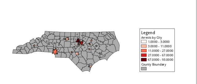
To show them how it’s done, let’s map out some information. Here are the absolute number of arrests, categorized by county and by city. Unfortunately, the city data which were available from the NC DOT did not have all of the cities in the arrest data, leading to 65 of 85 cities being represented in the map, explaining why some counties (eg, Cherokee) report arrests but contain no cities reporting arrest. This may introduce a bias in which smaller cities and towns are not represented when city-based data are used.
A few things seem to pop out: Arrests are geographically centered around the Triangle (Chapel Hill, Durham, and Raleigh), with other major centers around cities (eg, Charlotte, Wilmington, and Asheville). Comparing to other political maps (such as Amendment One or the 2012 presidential election), this pattern is not surprising, however, why it is happening is less clear.
One answer could be that the distribution of arrests simply scales with population, since a certain proportion of the population is likely to be willing and able to be arrested. We can test this hypothesis by looking at arrest density, ie, arrests per unit population. This reveals a somewhat more subtle pattern of participation in civil disobedience, but one that is still generally more concentrated in the central-eastern region of the state, and more diffuse on the periphery.
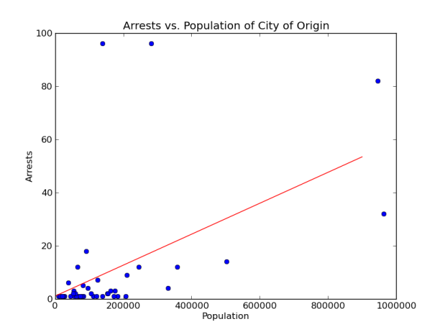
We can also investigate the connection between population and arrests quantitatively. When cities featuring an arrest are considered, there is a lot of scatter in the data. Nonetheless, a relationship is statistically clear (p ~0.0005), explaining about 25% of the variation in the data (r**2 = 0.26). Including the states counties without arrests increases the significance and the explanatory power of the relationship (r**2 = 0.31).

Fig 3. Arrests vs. population with linear fits. Whole-state fit (green): slope = 6.01e-05 arrests/person, r**2 = 0.31, p~2e-09. Arresting counties fit (magenta): slope = 5.8e-05 arrests/person, r**2 = 0.26, p~0.0005
Another possible behavioral divide is between urban and rural populations. Here, population density is interpreted as a proxy of urbanization. It appears that all but the least urban areas are sources of arrestees. Linearly regressing the data confirm this observation; the relationship is scattered, explaining about 32% of the variation in the data, but is statistically significant (p ~ 10**-9). On the other hand, there is some correlation between population and population density, so these measures are probably not completely independent.

Fig. 5a Counties featuring arrestees, categorized by population density, measured in people per square mile.

Figure 6. Arrests vs population density of the originating county. Linear regression has a slope of 0.033 arrests per person per square mile; r**2 = 0.32; p ~1e-09.
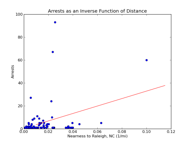
Another possibility which might explain the clustering around the Triangle is that distance tends to inhibit participation. In this case, one would expect that arrest number would be inversely correllated with distance to Raleigh. This distance, d, was measured using Google Maps, and converted to a nearness measure 1/(d+10); the addition of ten miles in the denominator accounts for intracity travel, and allows a Raleigh itself to have a defined nearness value. The results tended to confirm the hypothesis. The corellation between nearness and arrest number was significant (p~0.0008) but explained less of the data (r**2 ~ 0.15) than other hypotheses. The major outliers to the cities of Chapel Hill and Durham, both about 30 miles away, which contributed larger than expected numbers of arrests. Omitting the outlier cities increases the variation explained to ~27%, as well as the significance of the fit. The fit seems to be better at nearnesses closer to zero, ie, at greater distances.

Fig. 7 Arrest number vs. nearness to Raleigh. Nearness is an inverse function of distance, which is itself measured by the distance from a city to Raleigh, NC, as measured by Google Maps’ directions tool.
The arrest database also lists protester ages.
The arrestees are all over 18. The majority are between 60 and 70, whereas the distribution of the general population of the state begins to decline around age 50.
The database includes the occupations of some arrestees (387 of 457 reporting). This includes 47 unemployed. In other words, the unemployment rate of the arrestees is about 12.1%, only slightly higher than the general NC unemployment rate of 8.8%. It is common for the protesters to be depicted in internet comments as overwhelmingly unemployed, but these data do not support this notion. Considering the hostility of this legislature to the unemployed, it is surprising that the numbers are not higher! About 22% of the arrestees reporting an occupation are retired. 12% are educators. 11% are in the clergy. The rest of their professions may be visualized using a word cloud. It’s clear that they represent a diverse cross section of the workforce.

Fig 9. Arrestee occupations as a wordcloud, ie, bigger words are more frequently encountered in the dataset. Made at WordItOut.com; crappy watermark removed.

Fig. 10 Arrestee affiliation as a wordcloud, ie, bigger words are more frequently encountered in the dataset. Made at WordItOut.com; crappy watermark removed.
A wordcloud can also be used to visualize the reported affiliations of the arrestees. This shows a few things. The organization done by the NAACP and by faith organizations is apparent. The participation of other groups, such as the Occupy movement and Historic Thousands on Jones Street also shows up. The visualization also shows that the arrestees are involved in organizing on all scales, from national and international unions to regional, state, and citywide groups. (In an age of globalization, does “outside agitator” really even mean anything?) A final observation is that this infographic brings to the surface some of the issues which matter most to the arrestees: War and peace, torture and the death penalty, democracy, labor rights, the environment, and race relations.
Another common internet criticism of the demonstrations lies in race. The perception is somehow incongruent for an event organized by the NAACP to be primarily white (76%, vs. 15% black). The makeup of the arrestees confirms this perception of the racial makeup. But then again there is a large uncertainty associated with the 7% who reported Other as their race and in the many for whom the field is blank entirely. A more interesting question is, why is the arrest sample apparently depleted of hispanic people, compared to the general population? In any case, it’s not clear why it is a bad thing that white allies are organizing with the NAACP… unless you happen to have put yourself at the other end of that power.
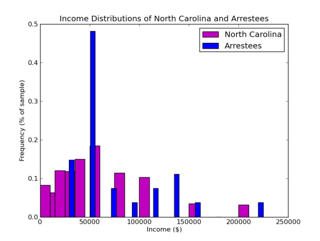
The Civitas Institute has assembled a database of the salaries of 27 public-worker arrestees. Compared to the state of North Carolina in general, there is nothing exceptional about the distribution of incomes. If anything, it is slightly depleted in low-income members (an effect of self-selection of the data) and slightly enriched in people with salaries around $50k/year (a typical teachers’ salary).
The creepers’ database only extends through 17 June 2013; including the 120 arrests on the 24 June protest presents something that should frighten the Civitas Institution: a clear picture of a growing movement.

Fig. 13 Arrests over time. Linear regression (green) as a slope of 1.95 arrests per protest per day, r**2 = 0.719, p~0.002.
Data Sources
Arrest Data: http://www.nccivitas.org/moralmonday/ <—- CREEPY. Also incomplete; friends of mine are missing from it ❤
GIS Map Data: https://connect.ncdot.gov/resources/gis/Pages/GIS-Data-Layers.aspx
Population Data:


Looks like it is time for you to direct the same screed to the CREEPY WRAL database now! Or are you a hypocrite and will ignore it?
http://www.wral.com/news/state/nccapitol/page/12663400/
The WRAL database does not list personal information on the protesters, and thus is not nearly as creepy. Its analysis is also much better than Civitas
Yes it does. All you have to do is go to the bottom of the page to input your criteria.
Which does not include their place of employment, or any other information which Civitas so tactfully included.
It is also much less complete as they did not take the steps to compare the arrest information to other PUBLIC information out there. That makes it less complete….but it is what you would expect from a radical left wing media outlet, so not surprising they want to cover up the true view of the circus.
Um. What?
“Information from the General Assembly protest database was entered manually by WRAL staff members Tyler Dukes and Kelly Hinchcliffe using arrest reports from the City/County Bureau of Identification’s Police-to-Citizen website, magistrate’s orders from the Wake County Courthouse and information accessed in person from Wake County Courthouse criminal database terminals.”
http://www.wral.com/general-assembly-protest-methodology/12680679/
They missed the easily obtainable public information on public employees that are arrested while attending the circus.
You mean the information in my Figure 12? Perhaps they didn’t consider it interesting?
Why are you so quick to defend clowns who try to outlaw sea level rise and institute state religion? It seems like the NCGA is the real circus here.
Oh! And, just to clear up the issue about the “cities” not existing in your data source – it’s because Civitas apparently isn’t actually using city of residence, but rather, the city listed in the arrestee’s address. This is significant, because postal addresses don’t always correspond to the actual municipality you live in. A lot of people who live in the Carrboro town limits have a Chapel Hill address, for example. Most of the place-names that stood out as not being in the NCDOT shapefile are unincorporated and therefore don’t have borders that would have shown up there.
You could try doing the analysis with postal code city data instead, if you can find the geographies for it. You can get ZCTA shapes (basically, zip codes) from the Census Bureau, and since every zip code corresponds to a place name (though it’s not one to one – some place names have multiple zip codes), that might work. But it’s probably not worth the effort because it wouldn’t tell you much more than the county data already has.
Might this explain some of the “voter anomalies” which Civitas claims to have found?
Hey Chuck! One small edit: Under Arrest Density:” Including the states without arrests increases the …” don’t you mean Cities?
Very interesting graphics. I think that one thing that isn’t considered in figuring who gets arrested and who doesn’t, is: Who has time? That would be older, retired people OR those who have means without working. (in addition to unemployed, who may not be able to afford the trip.) My friend Katy is a nurse, but works mostly as a volunteer, ie., able to take off. I will probably be there soon, and you know my situation. Then there’d be wives, mostly, who are supported by husbands who have a job. Also, it was obvious to me that counties with universities have greater numbers. Of course. Smarter people? I can’t explain the Cherokee county. Can you? Excellent work, my friend. Katy tells me that there are only two more Mondays planned. True? I need to put Ashe county on your map. ❤
That makes sense…people with nothing else to do go out and get arrested while the majority of NC goes about their daily business and does not care about these Money Monday circus events. The fact that they are not attracting more people each week speaks volumes about the general support there is out there. They will quickly run out of old, retired hippies from Carrboro to arrest.
“The fact that they are not attracting more people each week….”
Figure 13 disagrees, and updates made by Civitas and WRAL appear to confirm a steady linear growth in arrest size. Sorry.
The July 29th demonstration was the largest yet
http://www.charlotteobserver.com/2013/07/29/4199729/largest-moral-monday-crowd-yet.html
I can’t help but giggle at the fact that WordPress converted “Civitas’s” to “civitass” in the url. Appropriate, no?